


Ecoglove is a brand built for the "green medical glove" project of Eco Medical Manufacturer Corporation to "continue writing" the mission of protecting public health during the Covid outbreak. Established in 2021, when the shortage of medical gloves was at its peak, Ecoglove found its way into the market to fill that gap. While renewing the brand’s identity, the Founder of Ecoglove had the opportunity to share with Tree Creative about their desire to develop a brand made for the environment, the local communities, and the international market.


Challenges
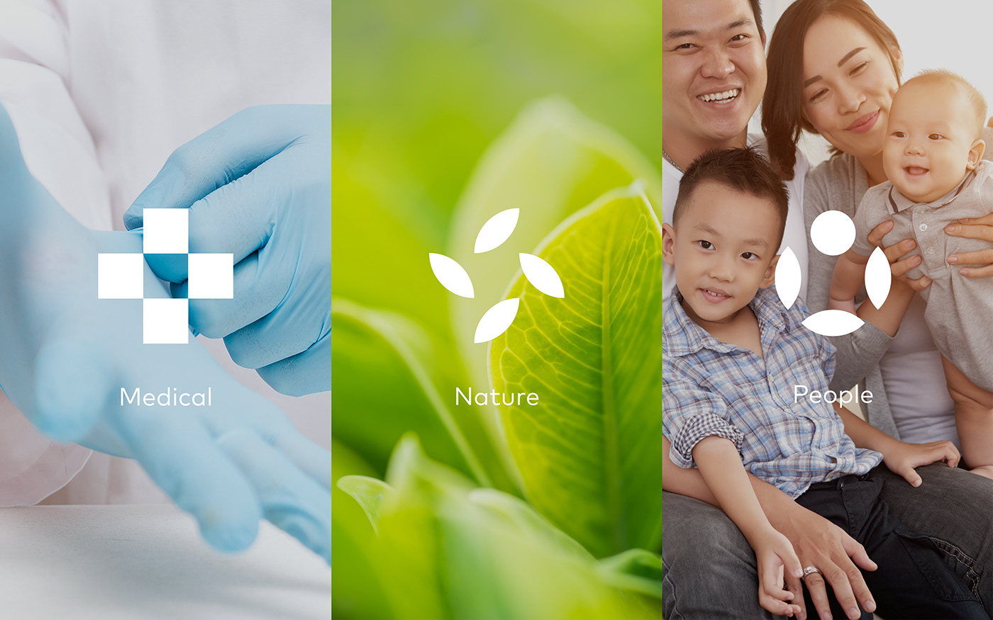
Ecoglove's aims are not only limited to supporting the health industry in the pandemic but also striving towards sustainable development, creating long-term values for communities locally and abroad. Therefore, the identity must clearly show the brand's characteristics. Producing and supplying medical gloves on a global scale and carrying the spirit of caring for the environment, and protecting users' health.


Solutions
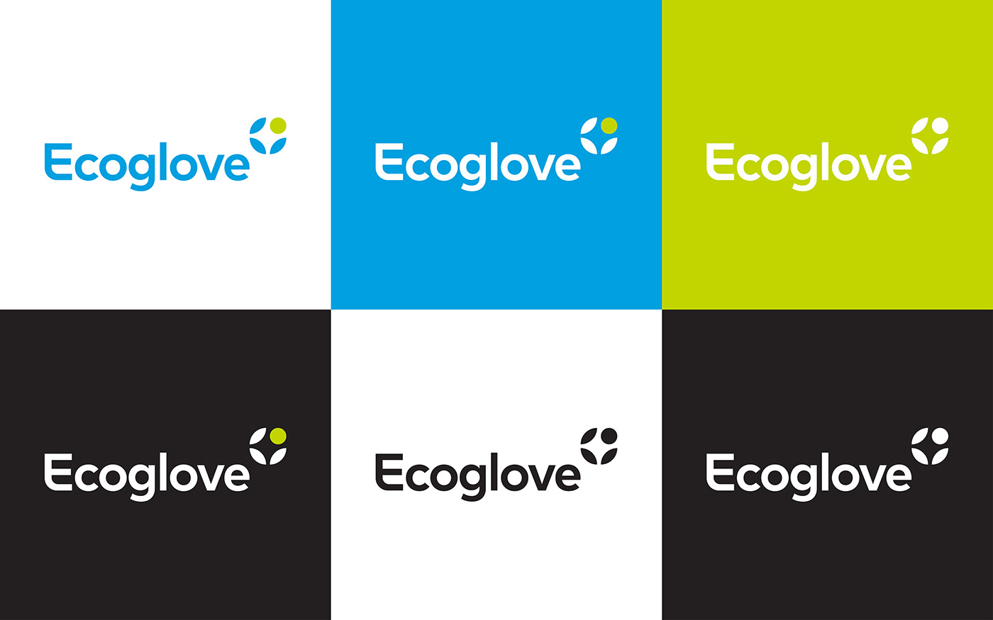
True to the name of the project "Green medical gloves" (creating environmentally-friendly gloves to protect users' health), Tree has brought the elements of nature and ecology combined with the first word in the brand name to build the logo symbol for Ecoglove. When looking at the logo, the image of leaves "gathering" and "impersonating" the letter "e" facing towards the "circle" will take the viewer along the logical chain of academic storying telling. The simplicity brings a sense of trust and security coming from a reputable brand, exuding the spirit of a "person" striving forward with vitality. The "leaves" as if calling to the circle, embrace it, representing Ecoglove's mission to always take care of and protect the community's health, always putting people at the center of protection. In addition to the meanings behind the brand spirit, the "+" sign (represented in negative form) in the logo is considered a complete affirmation of the brand’s field of operation by bringing the typical symbol of the medical industry, bringing the viewer a feeling of security and confidence.
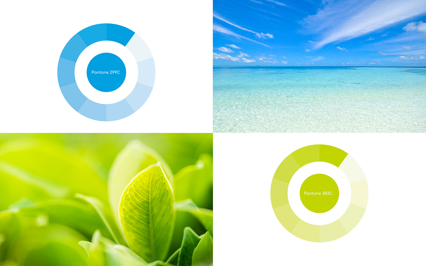
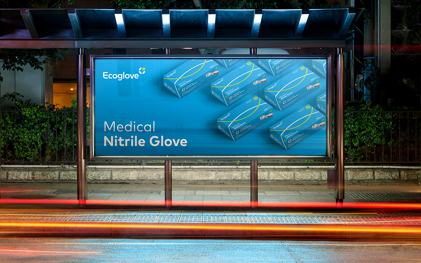
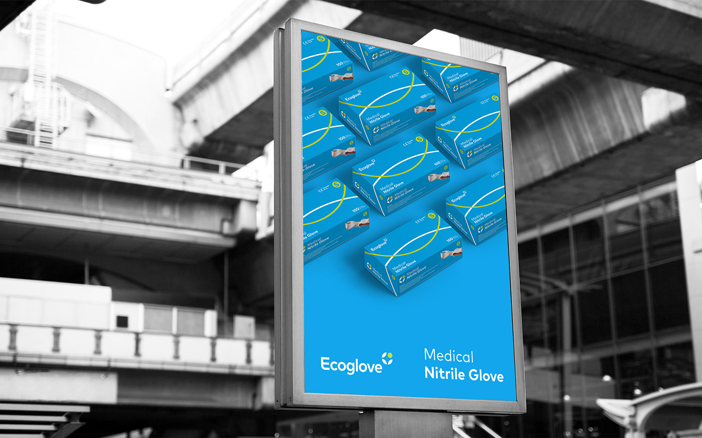
Tree uses green as the primary color, representing nature and health. Along with it, a lowercase font that helps businesses be flexible when applying the brand image towards synchronization, enhancing its professionalism.


Results
The brand identity is a harmonious combination of layers of meaning, expressing the specificity of the industry and the message and spirit that the brand wants to convey. With critical thinking, artistic interpretation, and minimalist design language, Tree has cleverly integrated images and symbols associated with the brand to create recognizable characteristics and logos, making it easy to remember for customers.


